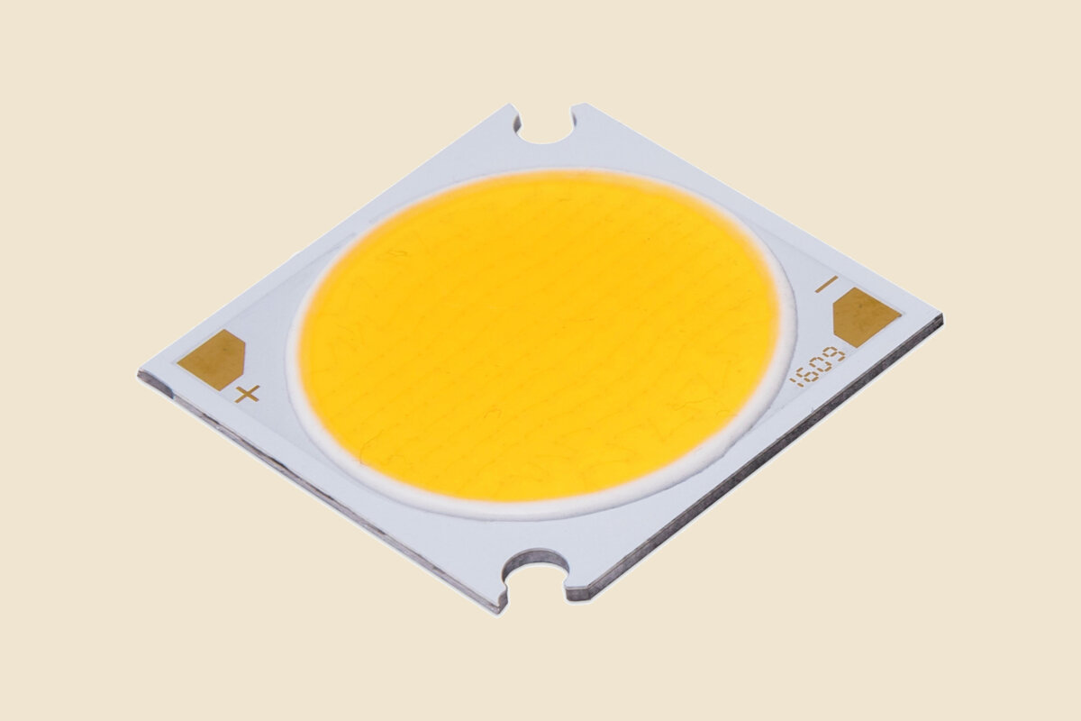
CRI tells you how faithfully a light source renders colours compared with a reference source of the same colour temperature. It is the most quoted quality number on a datasheet and the most misunderstood. A higher CRI usually means better colour, but it costs lumens, and a single number can hide weaknesses that matter in a shop or a restaurant.
What CRI actually measures
CRI (Ra) compares how eight pastel test colours look under the light source and under a reference, then averages the result on a scale up to 100. The reference is daylight for cooler sources and an incandescent-like source for warmer ones, so CRI 100 at 3000 K means "renders like a halogen lamp", not "renders like the sun".
Typical bands:
- CRI 80: the common minimum for indoor general lighting. Fine for circulation, back of house and most offices.
- CRI 90: the usual target for hospitality, retail and residential work.
- CRI 95 and above: galleries, museums, high-end retail, food and anywhere skin tones or materials are the point.
Why R9 matters
The eight colours in the average are all pastels. Saturated red, called R9, is measured separately and left out of Ra. White LEDs are often weakest in deep red, so a source can score CRI 80 or more with poor R9 and make red fabrics, meat, wood and skin look dull. For food, fashion and hospitality, ask for the R9 value, not just Ra.
TM-30: two numbers instead of one
IES TM-30 is a newer method using 99 colour samples instead of eight. It gives two main figures:
- Rf (fidelity), from 0 to 100: how accurately colours are rendered on average, similar in spirit to CRI but more robust.
- Rg (gamut), around 100 for neutral: above 100 means colours look more saturated than under the reference, below 100 means duller.
TM-30 also produces a colour vector graphic showing which hues are pushed or pulled. That is useful when a client wants warmth and richness rather than strict accuracy. Not every manufacturer publishes TM-30 data yet, so ask for it when colour is critical.
What higher CRI costs
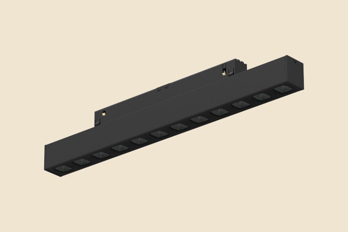
Better colour rendering comes from phosphors that give up some efficiency. Stucchi's own data shows the trade clearly:
| Fixture | CRI | Flux | Efficacy |
|---|---|---|---|
| Senzafine EVO UGR, 1125 mm | 90 | 2042 lm | 95.4 lm/W |
| Senzafine EVO UGR, 1125 mm | 95 | 1652 lm | 77.9 lm/W |
| Senzafine EVO HE Opal, 1021 mm, 4000 K | 80 | 2180 lm | 143.4 lm/W |
| Senzafine EVO HE Opal, 1021 mm, 4000 K | 90 | 2252 lm | 132.5 lm/W |
Moving the Senzafine EVO UGR from CRI 90 to CRI 95 drops output by about 19 % at almost the same power. That is a real cost in a large project, and worth paying only where people will see the difference.
A practical approach
- Set CRI 90 as the default for front-of-house spaces, and CRI 80 for back of house and technical areas.
- Use CRI 95 selectively: display, artwork, food counters, mirrors.
- Ask for R9 on anything with red tones, and TM-30 where the client cares about richness.
- Keep CRI consistent within one space. A CRI 80 source next to a CRI 95 one looks wrong even to people who could not name the difference.
Colour rendering starts at the LED and phosphor choice, which is why we look at it at component level. See what we do on our services page, or ask us about a specific application.